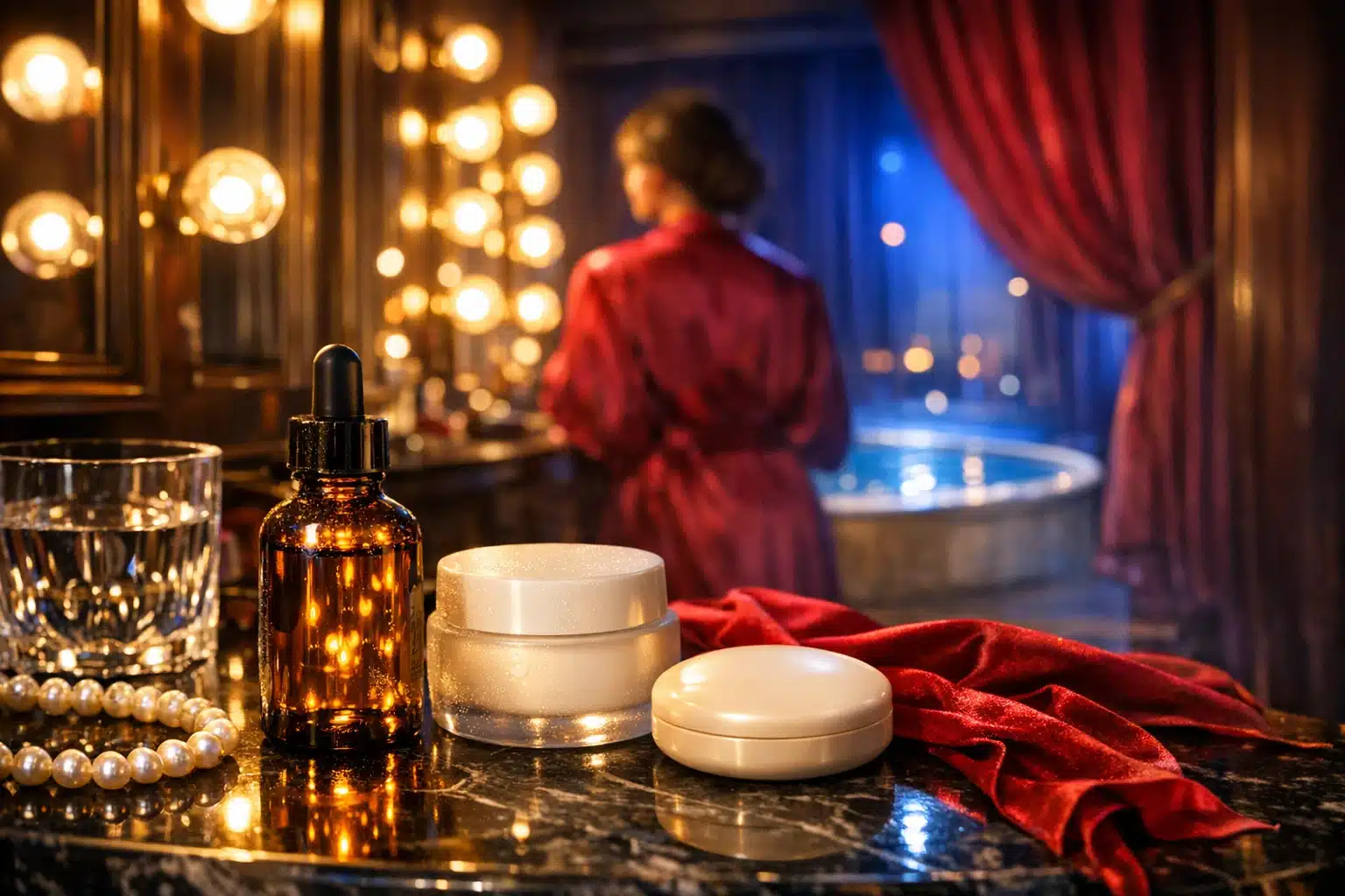
Cream for Deep Wrinkles Around Mouth – Your Guide to Smooth Skin
Understanding Deep Wrinkles Around the Mouth: Causes, Anatomy, and What to Expect
Every crease tells a story—of conversations, laughter, and daily expressions. Yet deep wrinkles around the mouth can arrive sooner or settle more firmly than we expect. To choose a cream that truly helps, it’s useful to understand how these lines form and what topical care can realistically achieve. In dermatology, lines around the mouth are often grouped into vertical lip lines (above the upper lip), marionette lines (framing the chin), and folds that deepen with smiling or speaking. Some are “dynamic” (from movement), while others become “static” as collagen, elastin, and fat pads diminish with time.
Outline of this guide:
– What’s driving perioral wrinkles and how to set expectations
– Ingredient science for creams that target texture, firmness, and hydration
– A practical routine for application without irritation
– How to compare textures, packaging, and value
– An action plan and when to consider professional options
What causes these lines? The skin around the mouth is in constant motion due to the orbicularis oris muscle; repeated pursing and speaking etch lines over time. Intrinsic aging reduces collagen and elastin, lowering skin elasticity and bounce. Extrinsic factors accelerate the process: ultraviolet exposure, smoking, pollution, high-sugar diets that promote glycation, and even sleeping positions. UV radiation, particularly UVA, penetrates deep into the dermis and is a well-known driver of premature wrinkling; daily broad-spectrum protection remains a cornerstone for prevention and maintenance. Smoking intensifies vertical lip lines by combining repetitive lip movement with oxidative stress that breaks down structural proteins. Over decades, bone remodeling and fat redistribution can deepen folds, making them appear more pronounced even at rest.
What can creams do? Topical formulas excel at three things: improving surface texture, boosting hydration and barrier strength, and signaling the skin to produce more of its own supportive proteins. Retinoids stimulate collagen synthesis and refine texture; alpha and polyhydroxy acids smooth and brighten; peptides and antioxidants support resilience; humectants and ceramides restore moisture and barrier lipids. While a cream cannot replace lost volume or fully erase static folds, consistent use often softens edges and improves how light reflects off skin, making lines appear shallower. Expect gradual progress measured in weeks to months, not days. The rest of this guide shows exactly how to identify effective ingredients, build a routine you can stick with, and decide when a richer texture or adjunct treatment makes sense.
Ingredient Science: Building a Mouth-Area Cream That Actually Performs
Effective creams for deep wrinkles around the mouth combine proven actives with supportive hydrators and a stable base. Start with retinoids, the most studied class for visible wrinkle reduction. Over-the-counter retinol typically ranges from about 0.1% to 0.5% for beginners, with 0.3% a common mid-strength. Retinal (retinaldehyde) at 0.05%–0.1% offers faster conversion to retinoic acid and is often well tolerated when encapsulated. Retinoids work by binding to nuclear receptors that regulate cell turnover and collagen production; many clinical programs track meaningful texture and fine-line changes at roughly 8–12 weeks, with continued gains thereafter. Because the mouth area can be sensitive, gentle vehicles (cream or balm bases) and slow ramp-up schedules are wise.
Next, resurface thoughtfully with hydroxy acids. Glycolic acid at about 5%–8% or lactic acid at 5% can smooth roughness and help ingredients penetrate, while polyhydroxy acids such as gluconolactone (5%–10%) or lactobionic acid offer similar benefits with less sting—useful near the lip border. Space acids and retinoids on alternate nights if you’re sensitive. Niacinamide (2%–5%) is another multitasker: it supports barrier function, reduces redness from irritation, and can improve uneven tone around the mouth.
Support actives with a balanced hydration-and-lipid matrix. Hyaluronic acid in multiple molecular weights (including cross-linked sodium hyaluronate) draws water into different skin layers for a plumper look, while glycerin and panthenol add long-lasting moisture. Ceramides, cholesterol, and fatty acids in ratios mimicking the skin’s natural barrier strengthen resilience; this is especially relevant as natural ceramide levels decline with age. Antioxidants such as stabilized vitamin C derivatives (e.g., magnesium ascorbyl phosphate at ~3%–10%), vitamin E, ferulic acid, green tea polyphenols, or coenzyme Q10 help neutralize environmental stressors that degrade collagen and elastin. If you prefer pure l-ascorbic acid for brightening, keep in mind it needs a low pH to work well and may tingle near the lips; derivatives are gentler and still supportive.
Sunscreen belongs in the same conversation as any wrinkle cream, because prevention amplifies every gain. Choose a broad-spectrum SPF 30 or higher for daytime; mineral filters like zinc oxide and titanium dioxide are often comfortable around the mouth and less likely to sting. Tinted mineral options can add shield against visible light, which contributes to uneven tone in many skin types. For evening repair, a peptide blend can complement retinoids by signaling collagen support (signal peptides such as palmitoyl tripeptide-1 or palmitoyl tetrapeptide-7 are widely used), though results are generally more subtle than retinoids. Put it all together and you get a high-performing formula blueprint:
– Core: retinoid + soothing humectants
– Gentle resurfacing: AHA or PHA (alternate with retinoid)
– Barrier: ceramides, cholesterol, fatty acids
– Defense: antioxidants + daily SPF
– Comfort: panthenol, allantoin, bisabolol to calm
No ingredient can halt time, but the right constellation can help skin behave more youthfully, improving the look of etched lines while keeping the delicate perioral area comfortable enough for long-term use.
Routine and Application: Techniques That Maximize Results and Minimize Irritation
Even a standout formula can fall short if application is rushed or haphazard. The mouth area is mobile and sensitive, so pacing and placement matter. Begin with a gentle cleanse to remove sunscreen and debris without drying the skin; lukewarm water and non-stripping cleansers are your allies. Pat dry, then apply a thin layer of a hydrating serum if you enjoy layering—think glycerin, hyaluronic acid, or panthenol. Wait 1–2 minutes before moving to your targeted wrinkle cream.
At night, use a pea-sized amount of retinoid-containing cream for the entire face and share a rice-grain dab around the mouth, staying just shy of the vermilion border (the pink lip). A buffering method can help: apply a light moisturizer first, then the retinoid cream to reduce sting, and seal with a balm or occlusive if you are very dry. If you’re new to retinoids, start two nights per week for two weeks, increase to every other night for two more weeks, then attempt nightly use as tolerated. Avoid combining potent acids and retinoids in the same evening until your skin is well acclimated.
Daytime is about protection and comfort. After cleansing, layer a hydrating serum if desired, then your wrinkle cream if it’s non-irritating for daytime, followed by a broad-spectrum SPF 30 or higher as the final step. Reapply sunscreen every two hours when outdoors or after eating and drinking that may remove product around the lips; a dedicated lip SPF is useful for the border itself. To reduce pilling, allow each layer a minute to settle, and use thinner, water-based textures before richer creams. If your toothpaste contains strong flavor oils or foaming agents that sometimes trigger perioral irritation, consider a milder option and rinse thoroughly—small changes can add up when you’re nursing a fragile barrier.
Helpful do’s and don’ts:
– Patch test new products on the jawline or behind the ear for 48–72 hours
– Introduce one new active at a time so you can identify culprits
– Use retinoids at night; wear sunscreen daily
– Skip harsh scrubs; choose chemical exfoliants at modest strengths
– Pause actives if you develop burning, scaling, or a rash; resume slowly once calm
Set expectations by timeline: improved hydration can be noticeable within 1–2 weeks, smoother texture within 4–8 weeks, and visible softening of etched lines often requires 8–12+ weeks. Consistency beats intensity; a tolerable routine you follow daily will outpace a “hero” product used sporadically.
Choosing and Comparing Formulas: Textures, Packaging, Sensitivity, and Value
“Cream” is an umbrella term. Around the mouth, the right texture depends on your skin type, climate, and tolerance for actives. Generally, occlusivity ranks as follows: ointment and balm (most occlusive), then rich cream, classic lotion, gel-cream, and serum (least occlusive). If your skin is dry, a ceramide-rich cream or a balm topcoat can help trap water overnight and visibly plump lines by morning. If you’re combination or oily, a lightweight gel-cream can deliver actives without feeling heavy or increasing congestion; humectant-heavy formulas often work well in humid climates, while lipid-rich creams shine in colder, drier air.
Packaging is not a trivial detail—oxygen and light degrade many wrinkle-fighting ingredients. Opaque, airless pumps or squeeze tubes protect retinoids, antioxidants, and sensitive lipids far better than wide-mouthed jars. If you do prefer a jar for its tactile experience, look for small sizes you’ll finish quickly and use clean hands or a spatula. Fragrance and essential oils can be enjoyable in body care, but they commonly irritate the perioral region; fragrance-free or very low-fragrance formulas tend to be kinder to this area.
Think of value in terms of cost per milliliter and the concentration of actives you’ll actually tolerate. A modestly priced, well-formulated cream you can use nightly often outperforms a pricier, ultra-strong one that gathers dust. Scan ingredient lists for clarity: retinol or retinal listed among the top third suggests a meaningful inclusion; a suite of ceramides and cholesterol indicates barrier support; humectants like glycerin or sodium hyaluronate near the top promise hydration. Avoid chasing overly long “kitchen sink” lists that combine many strong actives at once—especially if you’re prone to redness around the mouth.
Quick comparisons:
– Serum vs cream: serums penetrate quickly but may need a cream to seal; creams can deliver actives and occlusion in one step
– Balm/ointment use: excellent as a final step to reduce transepidermal water loss; choose when lines look etched from dryness
– Mineral vs organic filters in SPF: minerals are often gentler near lips; organics feel lighter but may sting sensitive skin
– Jar vs airless: jars are tactile but expose contents; airless protects stability and extends shelf life
– Rich vs light textures: match to climate and skin type; adjust seasonally for comfort and adherence
Lastly, consider common triggers in this area: menthol, peppermint oil, cinnamon derivatives, drying alcohols near the top of the list, and strong acids layered too aggressively. A calmer formula you’ll use daily is usually the smarter choice.
Conclusion and Action Plan: A Practical Path to Smoother Smile Lines
Deep wrinkles around the mouth are a conversation between muscle movement, time, and lifestyle. A well-chosen cream can’t silence that dialogue, but it can shift the tone toward smoother, more resilient skin. The most reliable results come from pairing proven actives with daily sun protection and steady habits that safeguard the barrier.
Here’s a straightforward 12-week plan:
– Weeks 1–2: Patch test; start a gentle night routine two evenings per week with a retinoid cream buffered by moisturizer; use a hydrating serum and SPF 30+ each morning; apply a lip-safe SPF directly to the border
– Weeks 3–4: Increase retinoid nights to every other night; on off-nights, use a 5% lactic acid or a PHA for gentle smoothing; add a ceramide-rich cream if you wake up tight
– Weeks 5–8: Aim for near-nightly retinoid use if comfortable; consider a peptide cream on non-retinoid nights; keep sunscreen consistent and reapply when outdoors
– Weeks 9–12: Maintain, or step up to a slightly higher retinoid strength if tolerated; track progress with well-lit photos taken every four weeks
Supportive habits magnify your efforts. Stop smoking if possible, as it accelerates vertical lip lines both mechanically and biochemically. Limit chronic unprotected sun exposure; UVA passes through windows, so daily SPF matters even on cloudy days. Manage triggers that can inflame the perioral area—strong flavors in oral care products, harsh scrubs, and aggressive actives layered without rest days. Sleep on your back if you can to reduce compression lines that form from repetitive pressure.
When is a cream not enough? If lines remain deeply etched or folds shadow the lower face, discuss in-office options with a licensed professional. Chemical peels, microneedling, fractional lasers, energy-based skin tightening, neuromodulators for strong pursing, or hyaluronic acid fillers for volume can complement topical care. These interventions vary in downtime, longevity, and cost; an experienced clinician will tailor choice and sequence to your skin type, tone, and goals. Even with procedures, daily skincare remains the foundation that preserves gains.
The takeaway: choose an effective yet gentle formula, apply it consistently, protect your efforts with sunscreen, and give the process time. Small, steady improvements add up—your smile stays the star, while the lines around it soften into the background.