How to Design a Product Page That Converts
Your product page is the final frontier between interest and purchase—so it needs to do more than just look good.
Our team found that ecommerce stores with optimised product pages see significantly higher conversion rates, reduced bounce rates, and improved customer trust. It’s not about flashy design—it’s about creating a seamless experience that answers questions, removes doubts, and encourages action.
In this guide, we’ll walk you through the essentials of effective product page design—from visual hierarchy and mobile UX to persuasion triggers and checkout integration. Whether you’re launching a new ecommerce store or improving an existing one, these tips will help you turn clicks into customers.
Pro Tip: Think of your product page as a digital salesperson. It should inform, inspire, and convert—all within seconds.
Quick Guide: Elements of a High-Converting Product Page
- Compelling product title and benefit-driven headline
- High-quality, zoomable product images and videos
- Clear pricing, availability, and shipping info
- Persuasive, scannable product description
- Prominent, mobile-friendly “Add to Cart” button
- Social proof: reviews, ratings, testimonials
- Trust badges, returns policy, and secure checkout indicators
Important: Every element on your product page should guide the visitor closer to purchase—remove anything that distracts or delays that goal.
Why Product Page Design Impacts Sales
While homepage aesthetics get a lot of attention, most conversions happen at the product page level. A poorly designed product page:
- Fails to build trust
- Leaves key questions unanswered
- Overwhelms with clutter or poor formatting
- Creates friction in the decision-making process
A well-optimised page, on the other hand, increases clarity, confidence, and conversions—without the need for aggressive discounts or pushy tactics.
Step 1: Start With a Clear and Compelling Headline
Your product title should be simple and searchable. But your headline or subheading can go a step further—highlighting a unique benefit or value proposition.
Example:
- Title: “Wireless Noise-Cancelling Headphones”
- Subheading: “Experience immersive sound and all-day comfort, anywhere you go.”
Step 2: Use High-Quality, Interactive Visuals
People don’t buy what they can’t clearly see. Invest in:
- Multiple product images from different angles
- Zoom functionality and 360° views
- Lifestyle shots showing the product in use
- Short demo videos or GIFs (especially for tech, tools, and wearables)
For fashion, include fit shots. For homeware, show scale. If possible, include user-generated content (UGC) to build trust.
Step 3: Optimise the Pricing and Purchase Area
The top right of your product page is prime real estate. This is where your Add to Cart button, price, and variant selectors should live.
Make sure to:
- Use a bold, clickable CTA button (“Add to Cart”, not “Submit”)
- Place it above the fold on desktop and mobile
- Show price, discounts, and savings clearly
- Highlight urgency if stock is limited (“Only 3 left in stock!”)
- Indicate shipping cost or time upfront if possible
Avoid forcing customers to click through multiple tabs or pages to get basic info.
Step 4: Write Descriptions That Sell, Not Just Tell
A product description should answer three key questions:
- What is it?
- Why should I care?
- How will it benefit me?
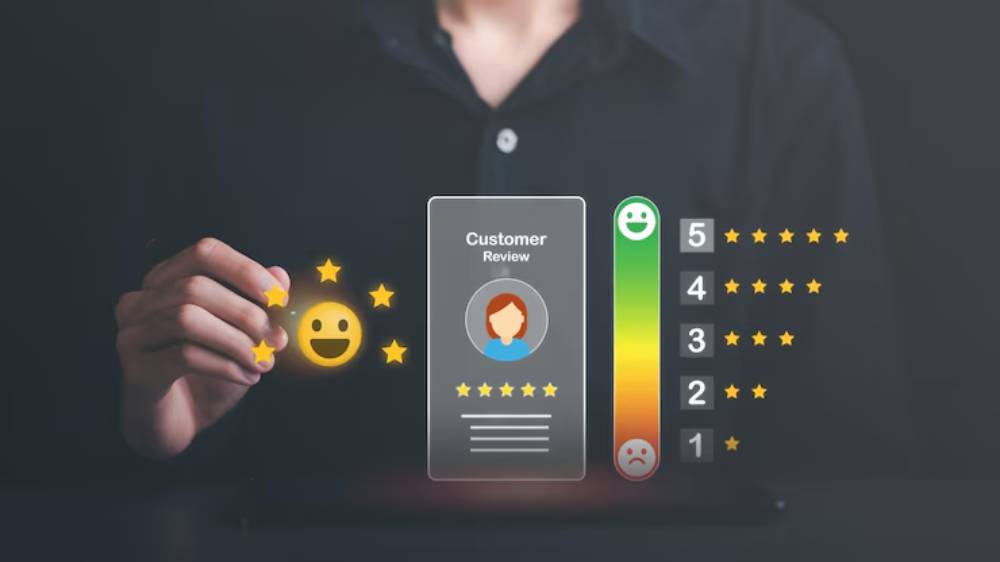
Step 5: Add Reviews, Ratings, and Social Proof

Social proof is one of the strongest conversion drivers. Make it easy for customers to trust you by including:
- Star ratings (visible near the product title)
- Verified buyer reviews with photos
- Curated customer testimonials
- Trust badges (payment security, satisfaction guarantee, etc.)
- “As seen in” or media mentions if applicable
Use tools like Loox, Judge.me, or Yotpo to automate review collection and display.
Step 6: Address Objections and FAQs Directly
Customers often leave because they’re unsure—not uninterested. Anticipate and overcome common objections with:
- FAQ section (expandable toggles for easy UX)
- Size guides or compatibility charts
- Shipping and return policies clearly linked
- Money-back guarantee messaging
- Live chat widgets or AI-driven support tools
The more confidence you build here, the fewer abandoned carts you’ll see.
Step 7: Design for Mobile-First Shoppers

More than half of ecommerce traffic is mobile—yet many product pages still prioritise desktop. Make sure your mobile experience is:
- Fast-loading (under 3 seconds)
- Vertically stacked with large buttons
- Easy to navigate (thumb-friendly design)
- Consistent CTA visibility while scrolling
- Accessible menus for product info, shipping, and reviews
Test your page on multiple devices and screen sizes before launch.
Step 8: Integrate Cross-Sells and Upsells Wisely
Once a customer is engaged, suggest relevant products without being pushy.
- Show “Frequently bought together” items
- Add a “You may also like” carousel below the description
- Offer bundle pricing or discounts for multiple purchases
- Use urgency cues for limited editions or flash sales
Keep it relevant—random product placements can backfire and reduce trust.
Step 9: Speed, SEO, and Technical Performance
Behind every beautiful page is a tech stack that supports performance. Ensure:
- Optimised images for fast loading (use WebP or compressed JPEGs)
- Descriptive, SEO-friendly product URLs
- Meta titles and descriptions include relevant keywords
- Structured data is in place for product schema
- Secure checkout is just one or two clicks away
Use tools like PageSpeed Insights, Hotjar, or Google Analytics to track and refine.
Best Practices for Continuous Optimisation
Design is never “done.” High-converting stores constantly test and improve. Consider:
- A/B testing different headlines, images, and CTA placements
- Heatmaps to analyse scroll behaviour and click activity
- Exit-intent popups with special offers or feedback forms
- Cart abandonment emails with product reminders and incentives
- Conversion rate monitoring to benchmark performance
What worked last year might underperform today—keep iterating.
Tools to Help You Build Better Product Pages
- Shopify / WooCommerce / BigCommerce – Flexible ecommerce platforms
- PageFly / Shogun / GemPages – Drag-and-drop Shopify page builders
- Klaviyo / Mailchimp – Email flows for abandoned carts or upsells
- Loox / Judge.me / Yotpo – Review and social proof platforms
- Hotjar / Lucky Orange – Heatmaps and on-page behaviour tracking
- Canva / Figma – Visual content creation and layout planning
Warning: Avoid overdesigning. Too many animations, sliders, or popups can overwhelm users. Simplicity and clarity always outperform flashy complexity.
Frequently Asked Questions About Product Page Optimisation
1. How many product images should I include?
Aim for 5–7, including close-ups, lifestyle images, and one showing scale. More if you’re selling clothing, tech, or luxury items.
2. Should I use tabs or one long page?
For mobile users, expandable accordions are better than tabs. On desktop, tabs are fine for separating details and reviews.
3. What’s a good conversion rate for product pages?
Industry average is 2%–4%. High-performing stores hit 5%–10% with strong branding, trust, and UX.
4. How do I handle out-of-stock items?
Show an “email me when back in stock” form. Don’t just hide the product—it’s still SEO value.
5. Should I include a live chat or chatbot?
Yes, especially for higher-ticket items or complex products. Instant answers increase conversions and reduce cart abandonment.
Design With Purpose, Convert With Confidence
Your product page isn’t just a digital shelf—it’s a high-stakes sales pitch. From images and copy to layout and UX, every element influences whether visitors buy, bounce, or bookmark.
By focusing on clarity, trust, and functionality, you can turn browsers into buyers—no gimmicks required. So audit your current pages, implement a few of these strategies, and keep testing. The payoff? A smoother customer journey, better brand perception, and higher sales.


